What does every SaaS landing page and homepage need? Eye-catching images, persuasive copy, satisfied customer testimonials – and, of course, engaging calls to action (CTAs). And what’s a CTA without a button that takes your users where they need to be – to sign up for your service, subscribe to your newsletter, or explore your documentation?
I’m sure we can agree that the best landing page is worthless if it doesn’t drive the user to action, right?
But what do you actually write on these buttons? At first, this may seem simple. Yet, as you gradually fill your website with CTAs and buttons, the page’s flow gets confusing, and you struggle to determine which button does what. How’s a user supposed to find their way around in this chaos?
I’ve created copy and microcopy for several SaaS websites and have experienced this chaos firsthand. So in this blog post, I’d like to share my learnings with you and give you five tips for creating consistent and engaging button labels for your SaaS landing pages that you can implement immediately to improve user experience.
Why should you care about button labels?
Button labels are part of what UX and copywriters call “microcopy.” These are small pieces of text you can find on any website or app, such as button labels, form placeholders, error messages, tooltips, etc. Though small, they’re critical to a great user experience as they guide users through your interface and convey important information.
Here are three reasons why we should care about microcopy on buttons:
1. Improve the user experience
Helpful and concise button labels improve the user experience by helping users navigate and interact with your website without thinking about what a button does.
The best buttons are usually those no one pays attention to because they provide an action that seamlessly fits into the given context.
Also, don’t forget accessibility! For example, users who navigate your website with assistive technology, such as screen readers, rely on button labels to understand the available actions.
2. Encourage users to take action (increase conversion rate)
Clear button labels enable users to confidently take action without second-guessing themselves. As a result, users are more likely to take the desired action, like signing up for your SaaS.
3. Strengthen your SaaS solution’s reputation
Effective microcopy can increase your users’ awareness of your brand and service. But, of course, you probably won’t build a loyal following just because you have great buttons.
However, you shouldn’t ignore the frustration and distrust that users gradually build up who have had a bad experience with your microscopy.
Overall, great microcopy can benefit your entire SaaS website and app. And if you’re interested, you can learn so much more about microcopy – I recommend this guide by Kinneret Yifrah to get started.
5 tips for writing button labels for your SaaS landing pages
Now that we hopefully agree on the importance of microcopy, we can roll up our sleeves and look at some tips and best practices to help you write better button labels for your SaaS landing page or homepage.
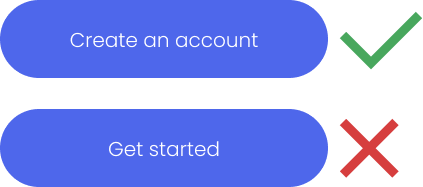
1. Use action-oriented language
Behind every button, there is an action. If there were no action, you wouldn’t need a button, right?
Since you want users to take action, it is best practice to write button labels in an action-oriented language, starting with a verb (the action).
Let’s see some examples!

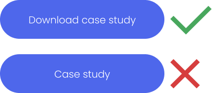
2. Make copy concise and task-specific
As mentioned earlier, users shouldn’t have to think about buttons at all. Instead, it should be a no-brainer to decide whether to press a button or which one to press.
Put yourself in your users’ shoes: What is their goal, and what do they want to achieve? And how does the button label match that goal? Considering these questions help you ensure your labels reflect the action a user wants to take.
Writing concise and task-specific button labels becomes even more critical when you have multiple buttons in a CTA, for example, one for signing up and one for booking a demo. Don’t make users think about the meaning of your buttons because, in the worst-case scenario, they don’t click one at all.
3. Use familiar language
Unless you are a professional copywriter, your credo probably should be “better safe than sorry.” I encourage you to use phrases that users already know from their daily internet browsing on other websites and apps.
If you visit some SaaS landing pages, you’ll notice they all use similar button labels. They do this because they know it’s better to present users with familiar microcopy instead of introducing them to brainteasers. Moreover, many of these companies typically invest in usability and A/B testing, so you can be sure they know their button labels work.
4. Stay consistent
In my experience, labeling buttons with consistent microcopy can be quite a challenge, especially when multiple people are working together. However, using consistent labels helps users recognize patterns and identify buttons they’ve encountered before.
Ultimately, consistency helps users think less about your buttons (again, that’s what we want) and makes your SaaS appear more professional and trustworthy.
I recommend creating a style guide for your website’s microcopy that specifies which button labels to use for which action. Everyone on the team should have access to this document and refer to it as they work.
Here are some topics to consider and include in your microcopy style guide when it comes to consistent button labels:
1 Define vocabulary
Determine which action words to use, think about synonyms that are allowed, and define the ones you don’t want to use.
For example, for logging users into your service, you should use only one phrase:
- Sign in
- Log in
- Login
- Sign up
- Register
2 Define the style
You either want to use title case or sentence case for your buttons:
Sentence case:

Title case:

I recommend deciding on a style and then sticking with it. In my experience, developers or the people who put the text on the actual HTML buttons are often unaware of the different styles and like to mix things up. Usually, the matter is solved if you explicitly point it out.
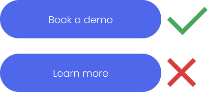
3 Reduce generic “learn more” buttons
Generic button labels like “Learn More” are often used when a button links to an information page, such as pricing or product features. Depending on the page length, two or three “Learn more” buttons can be okay. However, if you litter your page with them, users will increasingly have to think about what action is behind the buttons and whether they want to take that action. And that’s not what we want!
The thing is, you can’t rely on a user reading the copy that goes with a button. Because people often scan websites and only look at specific elements, like headings, images, and buttons.
That means they don’t know what they’ll learn more about because they are unaware of the context. Therefore, clarifying the button label and providing more context helps them decide whether to press a button without overthinking.
For example, instead of “Learn more” you could write:
- Explore all use cases
- Meet Feature XY
- Browse community projects
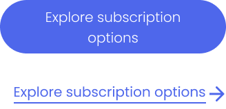
Note, however, that these labels are often quite long and may even make your design look awkward. In this case, you can opt for a different design and include an eye-catching link instead of a button element. For example:
5. Get real user feedback
The best way to ensure your button labels are well-written and clear is to have an outsider test your SaaS homepage or landing page.
Of course, you can run A/B tests to see which button labels work best, which is a good option if you’re doing some testing anyway.
If you’re not planning on A/B testing, user testing (or usability testing) with friends or strangers can be real eye-openers (and not just for your button labels, but for your entire site).
I recommend this Usability Testing 101 guide, which will get you started quickly.
Similar read: Create a better landing page with storytelling
Ready to write better button labels for your SaaS landing pages?
Ultimately, your SaaS homepage or landing page can only benefit from well-written button labels. Creating actionable, concise, and consistent captions can lead to a better user experience that helps you and your users achieve your respective goals.
I hope this article’s tips and best practices help you define button labels effectively, leaving you more time for other things, like writing great headlines and copy!

No responses yet